Funk Academy
BRAND DESIGN • LOGO DESIGN • CREATIVE DIRECTION
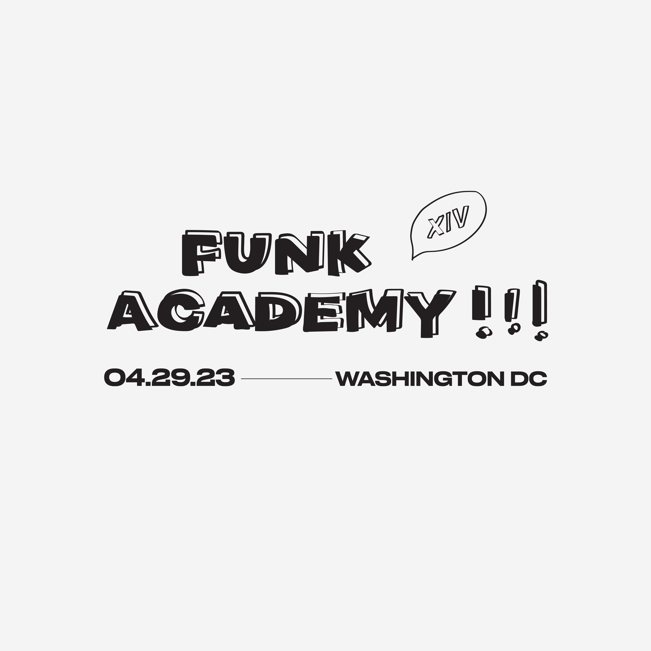
Funk Academy, a hip hop dance event based in Washington DC, required a brand refresh to draw more dancers to join the program. The brand refresh draws inspiration from the term academy and imagines the weekend as a youthful school-like environment. The illustrations represent doodles that young students in a classroom might draw. I had full creative control over the brand direction.
Throughout the weekend, dancers from the DMV and all over the East Coast come together to perform in a showcase, take classes, celebrate hip hop dance, and connect with the community. The brand refresh conveys the fun and playfulness of dance and connecting with friends.
The brand basics
Logos, fonts, and illustrations
Capital Funk, the performance’s host team’s logo, becomes doodle-ified.
Funk Academy gets a special hand-drawn typeface, loosely based on the bold sans serif that it’s paired with.
Hand-drawn doodle elements become part of the Funk Academy brand, including a lowercase version of the branded type.
Showcase social media tiles


Early sketches
I started sketching on paper with a vision of a doodle-inspired brand identity.
The brand in action
Promotional animation
Apparel design


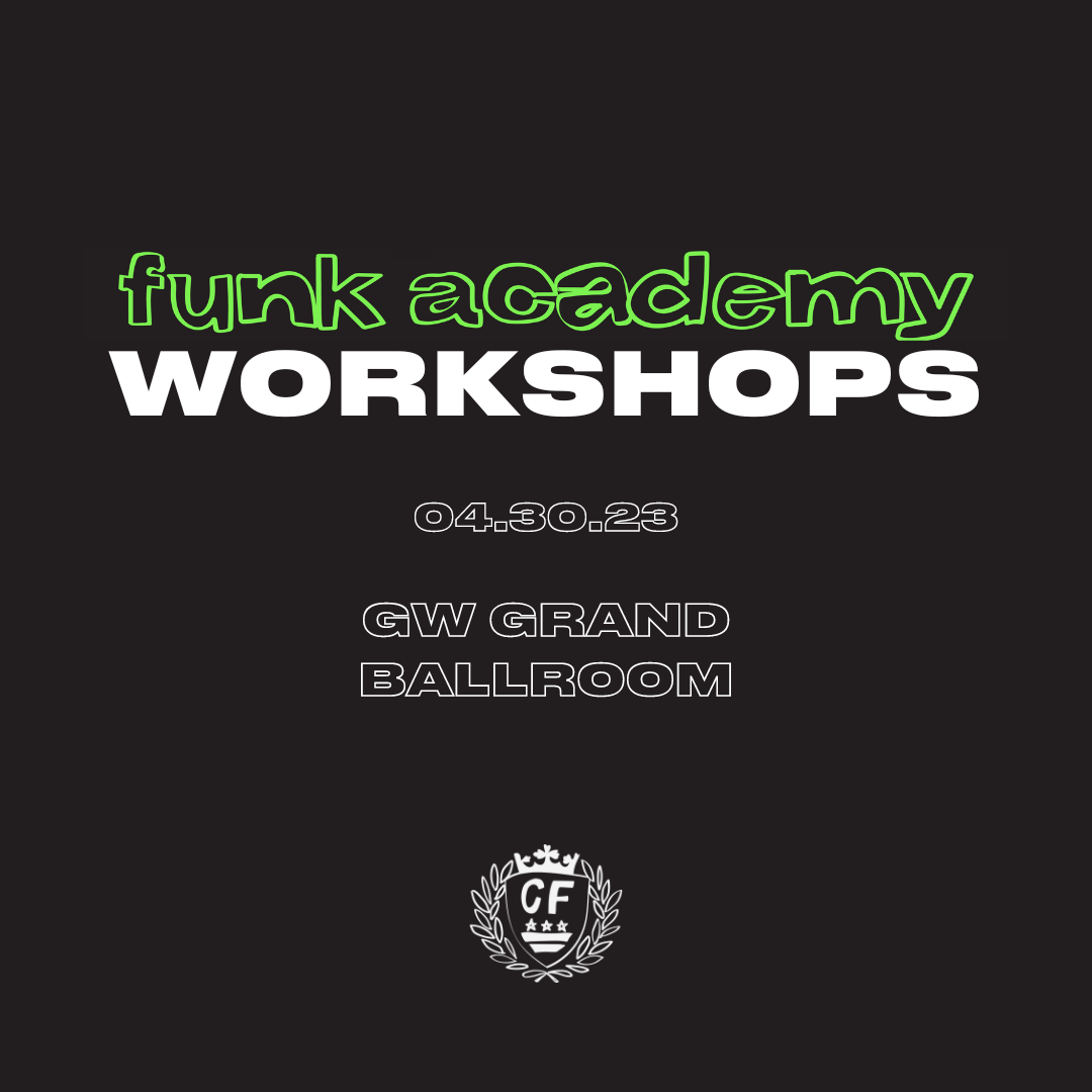
Dance workshops social media tiles
Adding Capital Funk’s green brand color helped differentiate the promotion of the workshops from the performance.


